

Author: Teresa Pankhurst
When we think about the great storytellers throughout time, they paint a picture of the landscape or the scene in which the story takes place. This allows the audience to form an image in their minds about what the characters look like, the kind of buildings in the vicinity, the era in which the story is set, or which woodland creatures are peering from behind a log. The author’s goal is to transport the reader into the world they’ve created, delivering a message or a version of history.
Just as great storytellers use vivid descriptions to bring their narratives to life, data visualisers (or visual storytellers) use charts and graphs to display insights hidden within raw numbers. Instead of using words to set the scene, we use colours, shapes and patterns to guide the audience through a story. Whether it is uncovering trends, highlighting anomalies or illustrating relationships between variables, a well-crafted report allows the audience to easily grasp complex data, evoking understanding and driving action through clear and engaging narratives.
So, where do you start?
Initially, developing a strong understanding of what the audience wants to know is a great first step. Sometimes this is an iterative process that develops over time as reports are produced and new questions emerge. Engaging with stakeholders and involving them in the process will ensure the visual story is impactful and relevant. Stakeholders will also be more likely to buy into the product being developed and be advocates.
Once the key questions are clear, the next step is to select the right visualisations to represent the data. There is a lot of collateral out there about how to do this. I like to break it down into 4 main categories. Do I want to:
- Display information
- Compare values with each other or within a category
- Show parts of a whole
- Analyse Data
This image serves as a good starting point for selecting the right visual. It focuses on basic native visuals available in Power BI, which are suitable for most scenarios, but many more options are available.
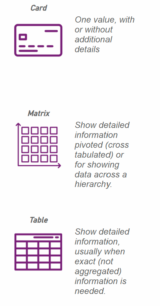
The Best Visuals To Use for Displaying Information
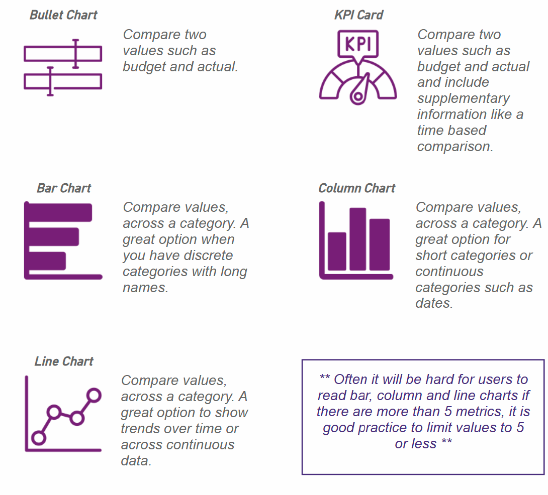
The Best Visuals for Comparing Values, Whether Against Each Other or Within a Category
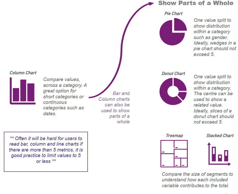
The Best Visuals for Displaying Parts of a Whole
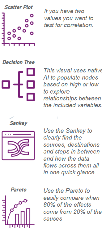
The Best Visuals for Analysing Data
My final piece of advice is to use basic design principles. Effective data visualisation isn’t just about presenting numbers; it’s about making insights clear, engaging, and easy to interpret. For example, using white space helps prevent clutter, allowing key insights to stand out and reducing the reader’s cognitive load. The Z-layout aligns with how many people naturally scan content, guiding their eyes from the top left to the top right, then down diagonally to the bottom left before ending at the bottom right. Be thoughtful about the use of colours and contrast, and ensure all visuals are appropriately labelled so readers are less likely to misinterpret the information.
Ultimately, data visualisation is a bridge between raw numbers and meaningful insights. Just as a great storyteller crafts a narrative that captivates an audience, a well-designed visualisation guides readers through data in an intuitive, engaging, and impactful way. By understanding your audience, selecting the right visuals, and applying thoughtful design principles, you can ensure that your data tells a clear and compelling story.
If you need help with your Data Visualisation, contact our friendly team HERE for a no-obligation discussion.